| | by admin | | posted on 9th March 2026 | About | | views 41 | |
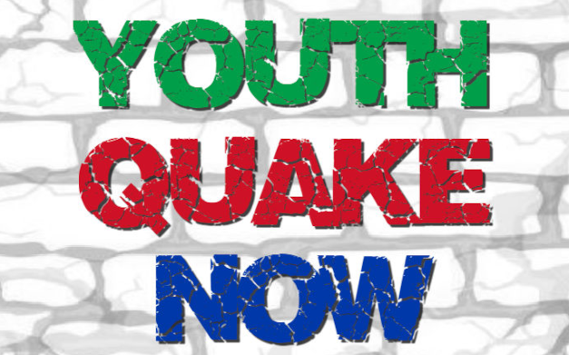
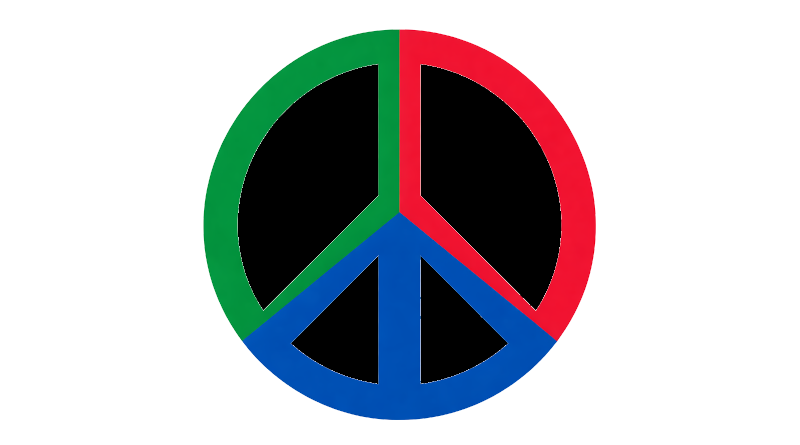
badger4peace uses green, red and blue as a simple visual language — where each colour expresses a different part of how peace is rooted, expressed and sustained.
Green is where the story begins.
It reflects the landscape of Lincolnshire: fields, hedgerows and open countryside shaped over centuries by work, community and quiet continuity. Many of the stories explored on badger4peace begin in this landscape, and the colour keeps that connection visible.
Green also carries a sense of renewal. It suggests that change is possible, that societies can grow, and that even long struggles for justice can move towards something better.
As the foundation of the palette, green anchors the website in place and in the idea that peace begins close to home.
Red introduces energy.
It reflects action, protest and the willingness to challenge injustice. Across the history of peaceful activism, red has often appeared in banners, posters and campaign materials, helping ideas stand out in public space.
On its own, red can feel urgent or confrontational. But within this palette it plays a different role. It becomes a reminder that peace is not passive. It requires people to speak, organise and act.
Red is the colour that makes belief visible.
Blue brings balance.
It reflects the sea and waterways that connect Lincolnshire to the wider world, but it also suggests something quieter: calm, openness and reflection.
Where red pushes outward, blue slows the pace. It creates space for thought, for listening and for the careful judgement that often lies behind meaningful change.
Blue allows the work of peace to be sustained rather than exhausted.
Each colour carries its own meaning, but it is their combination that defines the identity of badger4peace.
Green roots the work in place. Red makes it visible through action. Blue sustains it through calm and reflection.
Together, they form a simple idea: that peace must be grounded, expressed and sustained if it is to endure.
The palette is deliberately limited. It avoids excess and relies instead on clarity and repetition.
Across badges, images and pages, these colours quietly reinforce the same message. They do not need to be explained each time. Over time, they become recognisable as part of a shared visual language.
Like the stories explored on the website, the colours work through persistence. They return again and again, carrying meaning in a small and consistent way.
In that sense, the palette reflects the spirit of badger4peace itself — rooted in place, active in the world, and sustained through calm, thoughtful persistence.